


Written by Knight Fredel
Introduction
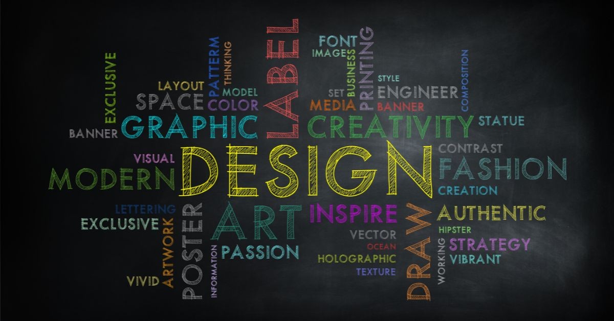
Design is more than just aesthetics—it is the combination of art, science, functionality, and psychology that shapes how we interact with the world. Whether it is graphic design, web design, product design, or interior design, every field adheres to fundamental principles that govern the effectiveness and appeal of a creation. Understanding the properties of design is essential for creating visually harmonious and functionally efficient compositions.
This article delves deep into the core properties of design, exploring each element and how they contribute to successful design execution. From color theory to spatial balance, every aspect plays a crucial role in shaping the final product.
1. Balance: Achieving Visual Harmony
Balance refers to the distribution of visual weight within a composition. It ensures that no part of a design feels too heavy or too light, creating a sense of stability and structure. There are three primary types of balance:
1.1 Symmetrical Balance
Also known as formal balance, it involves mirroring elements on either side of a central axis.
Common in corporate branding and traditional design aesthetics.
Creates a sense of order, elegance, and stability.
1.2 Asymmetrical Balance
Uses different elements of varying weights but arranges them to achieve equilibrium. Often seen in modern and dynamic designs.
Adds energy, movement, and a unique sense of interest.
1.3 Radial Balance
Elements radiate outward from a crucial point, like the petals of a flower.
Frequently used in mandalas, circular logos, and web interfaces.
Provides a focal point that naturally draws the eye inward.
2. Contrast: Enhancing Readability and Emphasis
Contrast is the principle of using opposing elements to highlight differences and create visual interest. Effective contrast helps emphasize key areas and improves legibility.
2.1 Color Contrast
- Uses complementary or contrasting colors to enhance visibility.
- Example: Black text on a white background ensures readability.
2.2 Size and Scale Contrast
- Using varied sizes to establish hierarchy and focus.
- Example: Headlines are larger than body text to signal importance.
2.3 Shape and Texture Contrast
- Combining different shapes and textures to create dynamic compositions.
- Example: A rough-textured background with smooth typography creates intrigue.
3. Emphasis: Directing Attention
Emphasis is the method of drawing attention to the most critical parts of a design. This is achieved by using:
3.1 Focal Points
- The main element that stands out, such as a call-to-action button.
3.2 Hierarchy and Alignment
- Arranging elements strategically to create a flow of importance.
- Example: Larger and bolder headlines guide the reader’s eyes naturally.
3.3 Negative Space (White Space)
- Using empty space around key elements to make them stand out.
- Often seen in minimalist web design for a clean and sophisticated look.
4. Repetition and Consistency: Creating Recognition
Repetition ensures coherence in design by reinforcing a consistent style, making the composition visually unified and recognizable.
4.1 Typography and Font Consistency
- Using the same fonts throughout a design maintains uniformity.
- Example: Websites with a single font family across all pages appear more professional.
4.2 Color Schemes and Branding
- Maintaining the same colors across different materials creates brand identity.
4.3 Iconography and Patterns
- Using recurring icons and shapes enhances user experience in digital interfaces.
5. Alignment and Proximity: Structuring the Layout
Alignment and proximity contribute to organization and clarity in design.
5.1 Alignment Principles
- Ensures elements line up in a structured way.
- Example: Left-aligned text is easier to read than randomly placed text.
5.2 Proximity for Relationship Indication
- Elements that belong together should be placed near each other.
- Example: Contact information is usually grouped instead of scattered.
6. Movement and Flow: Guiding the Viewer’s Eye
Movement refers to how the viewer’s eye navigates through a design. Effective use of movement ensures that information is consumed in the correct order.
6.1 Directional Cues
- Arrows, lines, and imagery that guide the eye naturally.
- Example: Websites often use visual cues to guide users to important sections.
6.2 Visual Storytelling
- Using imagery and sequence to narrate a concept or idea.
- Example: Infographics use step-by-step visuals to communicate complex data.
7. Color Theory and Psychology: Influencing Perception
Color plays a crucial role in the emotional impact of a design. Different colors evoke different feelings and reactions.
7.1 Warm vs. Cool Colors
- Warm colors (red, orange, yellow) evoke energy and passion.
- Cool colors (blue, green, purple) create calmness and trust.
7.2 Color Harmony
- Using complementary or analogous colors creates balance and beauty.
7.3 Brand Identity and Color Psychology
- Businesses use colors to evoke specific emotions in their audience.
- Example: Blue is widely used by banks to represent trust and reliability.
8. Functionality and Usability: The Core of Web and Product Design
")
Beyond aesthetics, design must be functional and user-friendly, especially in web development and digital interfaces.
8.1 User Experience (UX) Considerations
- The design should be intuitive and easy to navigate.
- Example: iFredeX Web Development ensures UI/UX principles for optimized digital platforms.
8.2 Responsive Design
- Ensuring compatibility across multiple devices.
- Example: Websites built by iFredeX adapt to both mobile and desktop screens seamlessly.
8.3 Accessibility in Design
- Making designs usable for people with disabilities.
- Example: High-contrast themes for visually impaired users improve usability.
Conclusion: The Art and Science of Effective Design
Design is a multidimensional field that requires a deep understanding of balance, contrast, emphasis, repetition, alignment, movement, color psychology, and functionality. Mastering these principles leads to more effective and visually appealing compositions.
At iFredeX Web Development, we integrate these properties into our web and digital designs, ensuring that our projects are not only aesthetically pleasing but also functional, engaging, and user-friendly.
Are you ready to transform your digital presence with professional design principles? Let iFredeX Web Development bring your vision to life!